Even the best companies companies can make mistakes in standard reporting and often fail to leverage the power of cohort reporting. This "manifesto" demystifies the path to reporting that will drive growth and blow away the board.
This is much more than a (really long) blog post, it is a manifesto of sorts. In our extensive work with growth companies, we have found that one of the most pervasive roadblocks preventing their businesses from reaching full potential comes from lack of visibility into performance. When a company is rapidly learning, iterating and expanding, traditional period reporting is simply not sufficient.
Executive Summary
To equip your board members, executive team and front-line leaders with the information necessary to make quick, data-driven decisions, you need to 1) make sure your period reporting is accurate and 2) strongly consider expanding your reporting to include cohort analysis. This will enable your teams to accelerate feedback loops and, in turn, adjustments that drive revenue growth, especially in a rapidly changing customer and competitor environment.
Written for everyone from the board to marketing and sales ops specialists, this guide will require an investment of time, but it will serve as a catalyst to set your company on a trajectory for accelerated, capital-efficient growth.
Introduction and Table of Contents
One key lesson many companies are (re)learning is that clear visibility into what drives business performance is imperative for growth. When the economy is a rising tide, companies can afford to deal with messy Salesforce data, inefficient processes and mediocre, brute-force spreadsheet reporting.
As marketing continues to eat sales and the customer journey becomes increasingly complex (as we discussed in a previous post), most businesses are being forced to find faster ways to determine what’s working, what’s not and get more clarity on their performance, especially when time and money are squeezed.
Even still, some of the most important components of accurate, helpful reporting go overlooked.
The two most common issues we encounter happen to be the most foundational:
Faulty point-in-time reporting
Lack of cohort reporting
As we will discuss, problems in these areas aren’t a matter of intellectual capacity, but most often are a result of bad data, a lack of systems integration and, most commonly, a lack of bandwidth and/or internal expertise (or experience) in a fast-paced environment.
This guide to basic growth reporting is written both to help companies build reporting that helps them understand how to increase performance (and track progress accurately) and to help those same businesses provide their board with unprecedented insight into their growth.
We cover a good bit of ground in this post, so we’ve put together a table of contents that you can use to jump to the section(s) most relevant or helpful to you.
Table of Contents
The Core Issue: Point-in-Time Reporting vs. Cohort Reporting
It's All About the Customer Journey Length
Point-in-Time Reporting
Use-Cases for Point-in-Time Reporting
The Subtle Dangers of Point-in-Time Reporting
Cohort Reporting
A Quick Note on the Data and Skills Required to Produce Cohort Reports
Use-Cases for Cohort Reporting
Summary: The Recipe for Growth Reporting Fundamentals
The Core Issue: Point-in-Time Reporting vs. Cohort Reporting
If you actively use cohort reporting to calculate benchmarks, test variations in the customer journey and provide insight on business performance improvement over time, then you can skip this section (we’d recommend reviewing the pitfalls of point-in-time reporting, which are helpful reminders for anyone working on reporting in your company).
If not, let’s get straight to the heart of the most common issue we see: the difference between point-in-time (also sometimes called ‘snapshot’ or ‘period’) reporting and cohort reporting. In our experience, very few marketing and sales ops teams spend time ingesting these fundamental principles, which often means reporting is a constant and expensive pain point that never really gets solved.
Let’s start with a few high-level definitions:
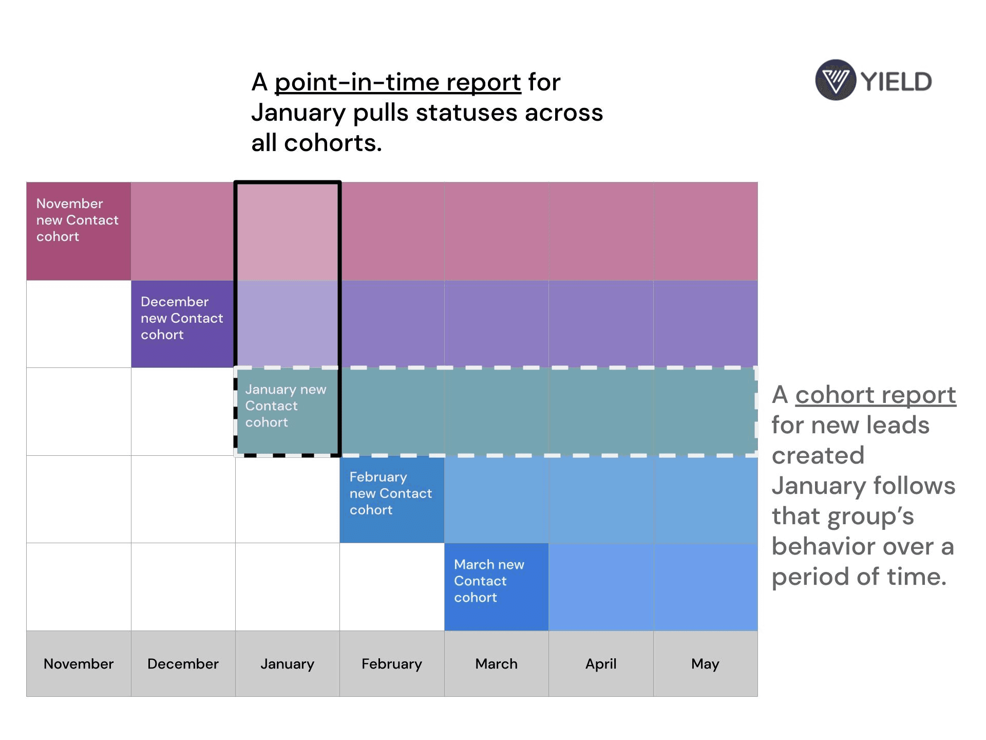
Point-in-time reports look at a cross-section of customers, prospects or users at a point-in-time.
This is the most common type of report in use by marketing and sales teams. For example, if you want to know how many new Contacts you created in January, you’d have your ops team pull Contacts with a create date in January. The population is the Contact records in your CRM, the cross-section is new Contacts and the point in time is January.
Cohort reports look at the behavior of a specific group of customers or users over time.
Actual use of cohort reporting is, unfortunately, rare. Using our example above, a cohort report would allow you to look at the behavior of Contacts created in January over time. Specifically, you could analyze how the “January new Contact” cohort converted to subsequent steps in the funnel and how long it took them to reach those steps (nurture, convert, contract, pay, activate, etc., depending on the business model).
Here’s a visualization we use internally to explain this concept to our growth associates and clients:
The high-level definitions are simple enough to grasp, but when applied in practical reality, especially for businesses with longer customer journeys (i.e. sales cycles), things start to get tricky. Let’s look at why.
It’s All About the Length of the Customer Journey
Much of this conversation can be boiled down to the importance of understanding the influence of customer journey length on reporting. Here are a few simple examples that illustrate the point.
Note, we have intentionally over-simplified certain scenarios throughout this post for the sake of illustrating key points.
B2B SaaS Example
Many B2B companies get into trouble when they perform an analysis in a reporting period that is shorter than the customer journey (it’s very easy to do this unintentionally, as we will see).
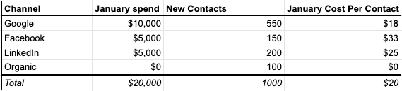
Let’s say you’re a B2B SaaS company with a 3-month sales cycle from new Contact creation to Closed/Won Opportunities and you want to analyze the effectiveness of your marketing spend in creating new prospects in the month of January. (Also, for the sake of the example, let’s say a majority of Contacts are created shortly after spend is deployed, even though that’s not always reality.)
Creating this report would be easy for you or your ops team: pull spend numbers for January, then pull all Contact records with a create date in January and you have visibility into your cost per Contact, volume and even perform a channel breakdown if you run a tight ship on tagging and attribution at the Contact level. The basic report might look something like this:
The next logical step is to think about conversion rates and figure out how your marketing spend is performing against lower funnel steps, like MQLs and Closed/Won Opportunities. (For those keeping score, we’ll discuss counting records VS status timestamps below, but will keep this example simple to illustrate the point).
That report might look something like this:
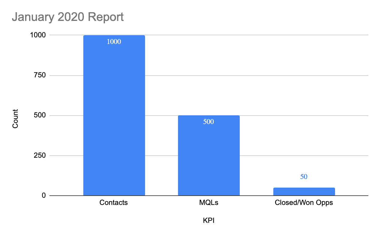
*This is the key juncture where many businesses start running into trouble.
This report isn’t wrong from a technical standpoint. What it reveals is volume in the pipeline in January (a point in time), but for most people, the natural response is to view the bars as sequential steps in the customer journey, then do simple math to figure out how many records converted and how spend looks against lower funnel steps.
Performing what amounts to a customer journey analysis with a point-in-time report, however, creates an inaccurate view of the business, for a few reasons, which we will unpack in detail in the point-in-time section below.
For now, let’s look at the high-level problems with interpreting this point-in-time report as customer journey steps:
Problem: the conversion rates aren’t reflective of reality (i.e., they’re simply wrong)
Remember, this business has a 3-month sales cycle, meaning that some number of new contacts convert to lower-funnel steps after the month they are created. In our example, the practical implication is that many new prospects created in January won’t become MQLs or associated with Closed/Won Opportunities until February or March.
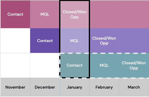
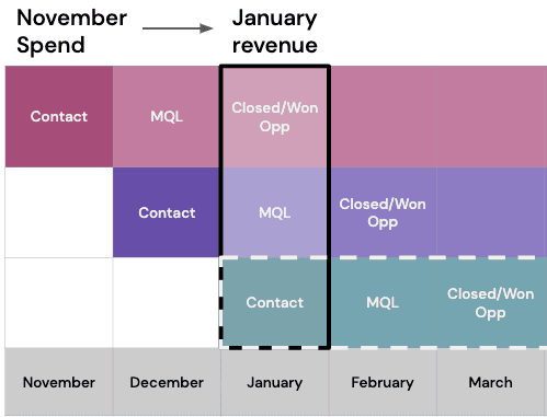
By the same token, the MQLs and Closed/Won Opportunities that we see in January are from contacts created in previous months. If we look at our handy chart, we see that it’s likely that many of our Closed/Won Opportunities in January came from contacts created in November. Here’s a simple visualization of this from our chart:
If volume, spend and the things you test to improve the customer journey all stay constant (which they rarely do, nor should they), the report above might give you a directional sense of conversion rates, but they shouldn’t be treated as truth or used for decision-making, because they only tell a partial story about a subset of your prospect base within a small time window. In other words, the report doesn’t show you what’s actually going on in the customer journey.
More on this later, but the punchline is that calculating conversion rates for a 3 month sales cycle using data from a 1-month time period gives you a wrong view of what’s actually happening in the customer journey (and, therefore, the business).
Problem: the customer journey is misrepresented
First and foremost, interpreting the report as a customer journey grossly misrepresents the velocity of that journey. The implication of this chart is that these new Contacts converted to lower-funnel stages in one month, but we know that’s not reflective of reality, which is a 3-month journey.
Second, the chart assumes that all MQLs were new Contacts immediately prior, which may be common, but isn’t necessarily the case across the board (think about campaigns to re-engage cold leads, lost contracts, etc.). We’ll look at this problem in more detail later in the article.
Problem: if you do math on spend for lower-funnel steps, the spend is misattributed
One other major problem with interpreting this report as customer journey steps is that spend for lower-funnel steps is misattributed. The cost per Contact for January is accurate, but calculating the cost per MQL or Closed/Won Opportunity produces inaccurate numbers. Remember, many of the contacts in lower-funnel stages were created before January, meaning they need to be associated with the spend (and campaigns) that happened in the month they were created. Again, here’s a visualization from our chart:
So do you simply adjust the reporting period?
You could certainly control for some of these challenges by looking at reporting in a 3-month window, but teams and priorities are managed on a weekly and monthly basis and, even with a larger window, point-in-time reports aren’t sufficient for revealing true business performance improvements over time and can still paint an inaccurate picture of conversion rates across the entire population of prospects and customers.
Point-in-time reports are extremely useful, but for insightful business intelligence on conversion rates and customer journeys, there’s a better way. (If you want to skip to the solution, jump down to our section on cohort reporting.)
Direct-to-Consumer eCommerce Example
On the other end of the spectrum, many high-velocity businesses, like eCommerce for example, get into trouble when they start analyzing or testing longer customer journeys and try to use point-in-time reporting to evaluate effectiveness. (This is essentially the inverse of the B2B example above, so we’ll keep it short.)
Let’s say you’re an eCommerce business and your customer journey, from visit to purchase, is a few days. In contexts where the customer journey happens at a high velocity, point-in-time reporting works really well for most meaningful reporting periods, even for customer journey analysis. Here’s a version of our chart that visualizes a weekly view of eCommerce customer journeys:
An eCommerce company is certainly going to look at daily sales numbers, but because of fluctuation, seasonality and testing (promotions, site improvements, etc.), they likely spend more time analyzing weekly sales numbers (that roll up into longer reporting periods).
Because most conversions happen within a few days, a point-in-time report for the prior week (especially a rolling 7-day view) will include all journey steps for a majority of customers in that time period, meaning that the report can provide accurate estimates of average conversion rates and velocity from first visit to purchase.
Let’s say, though, that you want to begin testing retargeting and email campaigns to drive repeat purchase. A customer journey that was several days before is now several weeks and, for your most loyal customers, much longer.
At this point, it should be easy to see that the weekly point-in-time report, while incredibly useful, is rendered insufficient for understanding what drives lifetime value and repeat purchase.
Ask These Customer Journey Questions Before Building Reports
Companies that struggle with confusion and pain around reporting can clarify their approach significantly by answering a few questions, all related to the customer journey:
1. How long is your customer journey (sales cycle)?
If you can't achieve a data-driven answer, what's your hypothesis?
2. Are you measuring pipeline volume or steps on a customer journey?
If you’re measuring steps on the customer journey, do all of those steps happen within the reporting period you’re analyzing?
Will a point-in-time report reveal what you want to know? If not, consider a cohort report (more on this below).
3. Are you attributing spend or other initiatives to down-funnel steps in the customer journey?
If you’re attributing spend or other initiatives to down-funnel steps in the customer journey, do the spend and/or initiatives fall within the reporting period you’re analyzing?
Will a point-in-time report reveal what you want to know? If not, consider a cohort report (more on this below).
Point-in-Time Reporting
Overview
We covered a basic definition of point-in-time reporting above, so let’s look at an overview of how and when to use this reporting methodology. It’s important to note here that point-in-time reports drastically increase in their utility when infused with data derived from cohort reports, namely required volumes and goals, which we cover in more detail in the cohort reporting section.
It’s also worth noting that most systems (i.e. CRM, marketing automation, analytics, etc.) only offer point-in-time functionality and the “period” view of revenue is standard for financial reporting, which is why point-in-time reports are the most commonly used type of intelligence across all businesses.
For now, let’s cover a few of the best use-cases for point-in-time reporting.
Use-Cases for Point-in-Time Reporting
Top-of-Funnel Acquisition Reporting
As we explained in the example above, point-in-time reporting is great for understanding acquisition performance at the top of the funnel. In fact, we often help companies structure detailed, simple-to-use point-in-time reports for rapid acquisition or content testing. When combined with a clear tagging framework, these reports can help growth teams optimize at a much faster pace.
>
High-Level Attribution Reporting
If you have a robust tagging and attribution framework for your acquisition efforts and have connected that data through the customer journey, point-in-time reports are a great way to get a high-level view of efficacy. This is less of an issue for high-velocity customer journeys, but can provide significant insight to B2B companies. Let’s say the B2B company in our example above wants to know which channels led to the Closed/Won Opportunities in January, regardless of when the associated Contacts were created. If the data is in place, pulling a report that breaks down Closed/Won Opportunities by original source is simple, but powerful, especially as efficacy is analyzed month-over-month.
Volume Pacing & Current State
If you’ve used the proper methodology to calculate conversion rates and required volumes to meet your goals (which we will discuss in the cohort section below), point-in-time reports are an excellent way to understand if current pipeline volume is tracking towards goals and required volumes. In this context, you aren’t looking at journey steps, you’re answering the question, “are we producing enough volume to produce the desired mathematical outcome at the end of the customer journey?” Let’s go back the the January report above, but layer in volume goals (and ensure we’re counting status timestamps, not records, which we will discuss below):
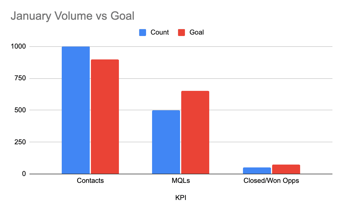
When we’re not interpreting these as funnel steps, this becomes a very helpful report. We can see that we beat our Contact goal, but are behind on both our MQL goal and Closed/Won Opportunity goal. Which leads to the next use case:
Goaling and prioritization for teams
Again, if you have properly calculated conversions, required volumes and goals, point-in-time reports are an incredibly helpful tool for team leaders driving prioritization and goals for their teams.
Look at the example above. It’s a simple report, but a growth leader can quickly identify the areas that need further scrutiny. They might start by looking at MQLs. Why aren’t we converting enough MQLs? It could be a lead quality problem, a nurturing problem, or something else.
The subtle dangers of point-in-time reporting
As useful as point-in-time reports are, they’re very easy to mess up and misinterpret, resulting in a skewed view of the business, especially if the company has a longer sales cycle. Many times, these mistakes can be traced back to bad or unavailable data, most often related to statuses and timestamps.
No matter the mistake, you’ll notice in the pitfalls we cover below that trouble begins when point-in-time reporting, which is useful for looking at current and past states as periods, is used to attempt analysis of user behavior over time or perform some sort of forecasting exercise (conversion rates, etc.).
With that in mind, let’s look at a few pitfalls that are extremely common, especially among companies in the mid-market.
Danger #1: Treating Distinct Records as Statuses
One of the easiest mistakes to make in point-in-time reporting is equating statuses with distinct records. This mistake can lead to over or under counting in the pipeline and confuse prospects with key touchpoints (or statuses) that lead to conversion.
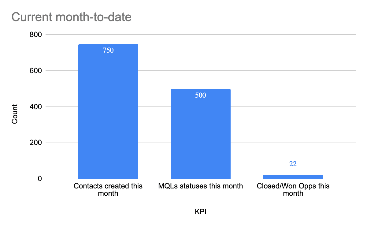
Let’s return to a version of our B2B report above, but for the current month-to-date. You’re interested in understanding how many MQLs you’ve created, so you have your ops team pull the data.
When your ops team creates the report, they pull 1) Contacts created this month, 2) Contacts with a status of MQL and 3) Opportunities with a Closed/Won date this month. Here are the results:
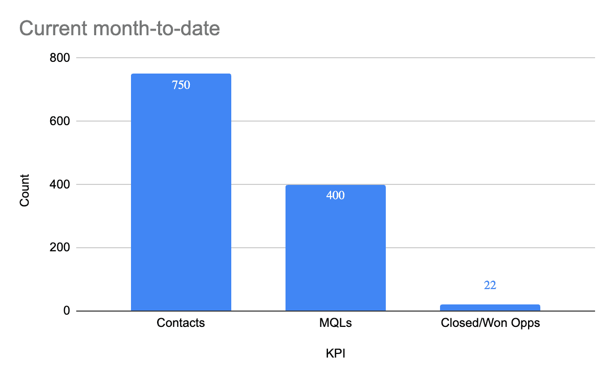
As we saw above, this report is technically accurate as far as volume in each individual bar, but it doesn’t show you how many total MQLs have actually happened this month. It only counts only distinct records with a current status of MQL. Why?
Because you’re counting distinct records and filtering for a status of MQL, but statuses can change. If multiple contacts who had a status of MQL have converted either into a Closed/Won Opportunity or a Gone Cold status, they aren’t counted, meaning you don’t have an accurate view of the total number of MQLs to date in the month.
Notice that the report pulled and counted timestamps for both Contacts and Closed/Won opportunities, whereas the MQL number comes from counting distinct records that have a particular status. It’s very easy to make this mistake with mid-journey touchpoints where a timestamp either isn’t being captured or isn’t exposed and leveraged in reporting.
Accurate point-in-time reporting is all-or-nothing: either count distinct records for current status, or statuses/touchpoints within a time period, but NOT both.
Back to our example: if the goal is understanding how many MQLs were created, we need to count all MQL statuses that have a timestamp of this month, regardless of what the current status of the related individual record is.
Getting a handle on statuses isn’t a cure-all, though. For example, in a sales-heavy environment, it’s often the case that a flurry of status updates happen at the end of the month, which can lead to volatility in numbers relative to what they looked like earlier in the month. (These types of issues make a strong case for layering in cohort reporting, which we will discuss in detail below.)
The status/record conversation leads us directly to pitfall #2, which is the inverse of pitfall #1:
Danger #2: Treating Statuses as Distinct Records
One of the easiest mistakes to make in point-in-time reporting is equating statuses with distinct records. This mistake can lead to over or under counting in the pipeline and confuse prospects with key touchpoints (or statuses) that lead to conversion.
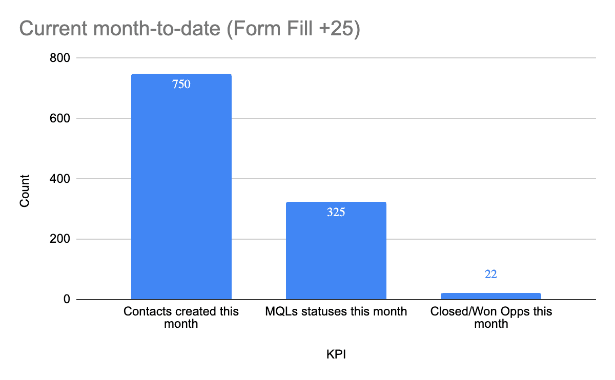
Let’s say we catch our mistake from the first report and count MQL status timestamps within the current month. Here’s the report:
The new Contact count and Closed/Won count are the same because they were already counting timestamps, but we can see here that we’ve actually created 500 MQLs (not 400) according to the number of status timestamps this month.
The pitfall here is counting status timestamps as individuals (which can also lead to interpretation of the report as journey steps). Because a distinct record can have multiple statuses over time, it can (and often is) represented multiple times across status categories. In this particular example, it’s very likely multiple records who had a status of MQL this month signed contracts, which means they are also associated with Opportunities that have a status of “Closed/Won.” In our chart, they would be counted both in the 500 MQL timestamps and in the 22 Closed/Won Opportunity timestamps.
In other words, it can be very easy, especially in the middle of the funnel, to mistake events for individuals, especially when certain data points, like create date for contacts, align with the actual individual count.
As you can see, though, counting statuses as distinct records can be a particularly painful mistake because misrepresentative overcounting makes volume look better than it is in reality.
Danger #3: Viewing Records in a Point-in-Time Report as a Cohort
We looked at this mistake in the initial examples above, but it’s worth reiterating because it is one of the most pernicious of all of the pitfalls in point-in-time reporting.
We will be as direct as possible: misinterpreting a point-in-time report as chronological steps taken by the new Contacts in the report can not only be inaccurate, it can lead to poor decision making that harms the business and creates confusion around how to drive growth, especially between marketing and sales teams. Again, this is particularly true for businesses with longer sales cycles.
This mistake, though, is incredibly easy to make when a point-in-time report happens to be directionally in line with your sense of business performance. To illustrate this point, let’s look again at our timestamp report from above for the B2B business with a 3-month sales cycle.
For most people, it’s natural, on first glance, to look at this report as chronological steps because we’re so used to treating the x-axis as a measurement of time (which is an argument for a different visualization, but that’s another topic for another post).
But what if the report looked like this:

It almost feels counter-intuitive in this visualization, but this view isn’t uncommon in accurate reporting.
In this particular case, the business is probably experiencing a particularly low-volume month for net-new Contacts, but had a huge push across teams to drive MQLs from the contact database (perhaps in response to the goal report we discussed earlier). In that context, it's likely that many of the MQLs had statuses other than new Contact immediately preceding the MQL status (Contacts that went cold or had bad timing who re-engaged and converted to the MQL status).
With those details in mind, it’s easy to see how this point-in-time report can produce a lower-funnel touchpoint count that’s higher than the new Contact timestamp count.
The customer journey questions above are a great rubric for gut-checking interpretation of your point-in-time reports.
Danger #4: Viewing Records in a Point-in-Time Report as a Cohort AND Calculating Conversion Rates Between Steps
We looked at this mistake in the initial examples above, but it’s worth reiterating because it is one of the most pernicious of all of the pitfalls in point-in-time reporting.
We mentioned this mistake above as well, but, again, we’ll reiterate it here with more detail because getting this wrong can be very damaging.
Let’s return to our month-to-date report for the B2B company:
Carrying the inaccurate, step-by-step cohort misinterpretation to its logical conclusion, there is a strong temptation to do math between false “steps.” In practice, you’d make this mistake by concluding that your New Contact → MQL conversion rate is about 67% (500/750) and your MQL → Closed/Won Opportunity conversion rate is over 4% (22/500).
There are some major problems here. First, we’re doing math on statuses, not distinct records, so this isn’t a reflection of the actual number of potential customers represented by individual records. Even if we did pull the report with distinct records, though, we would be looking at the point-in-time state, not the total number of MQLs actually created this month, as we discussed before. The conclusion here is that, in many cases, point-in-time reports are not useful for calculating the conversion rates that drive the business.
Worse, though, is the mistake of going beyond conversion rates and calculating the quantities required to hit goals. Let’s say our goal is 600 MQLs for the month. If we follow the faulty path we’ve been on, we’d conclude, from this report, that we need almost 900 new Contacts to hit our goal (600 MQLs / .67 conversion from new contact to MQL = ~895 new Contacts). In reality, though, this report gives us no indication of the population size that produced the 500 MQLs that have happened this month, when they were created, or what other steps they took (or didn’t take) along the way.
If the required population size happens to be 1500 Contacts, not 900, you’re setting yourself up for missing future goals in a significant way in coming months.
Danger #5: Not Planning for Changing Status Definitions
Some statuses in the customer journey are straight-forward and durable, meaning they are unlikely to change (or can’t be changed). New Contacts and Closed/Won Opportunities are good examples—the definitions of those statuses will always be the same.
When you look at more subjective statuses, definitions become much less durable. Take MQL as an example. Generally MQLs meet some sort of criteria, ideally based on lead scoring. If the criteria for the status change, the actual volume in point-in-time reports will change as well.
As an example, let’s say you’re leveraging standard scoring in Pardot and your definition of an MQL is a prospect with a score of 50 points or more.
Standard Pardot scoring grants +50 points for a form fill, but after some analysis, you determine that form fills shouldn’t be weighted that heavily in terms of qualification, so you drop the value to +25 points. When you make the change, many prospects who were previously considered MQLs because they filled out forms won’t meet the 50 point threshold anymore, which will decrease the count of MQL statuses in your report.
Even though nothing has changed but the definition, uncoordinated updates to qualification criteria, especially when they decrease the count of key KPIs in the customer journey, can have negative impacts across the organization, especially between marketing and sales. Also, if prior reports have been distributed already, subsequent reports, though accurate, tend to create optics that require explanation (conversations that tend not to be enjoyable).
Changes in criteria for statuses need to be carefully communicated, coordinated and timed across the organization.
Explaining the before and after examples below is never fun, especially when there’s a 30% difference in the wrong direction.
Before

...and after
Example: Why Cohort Reporting is Needed
Returning again to our B2B example from above, let’s say it’s late in Q1 and you are analyzing performance to see how results are going to stack up against our goals. Here are the charts for pipeline volume and revenue:
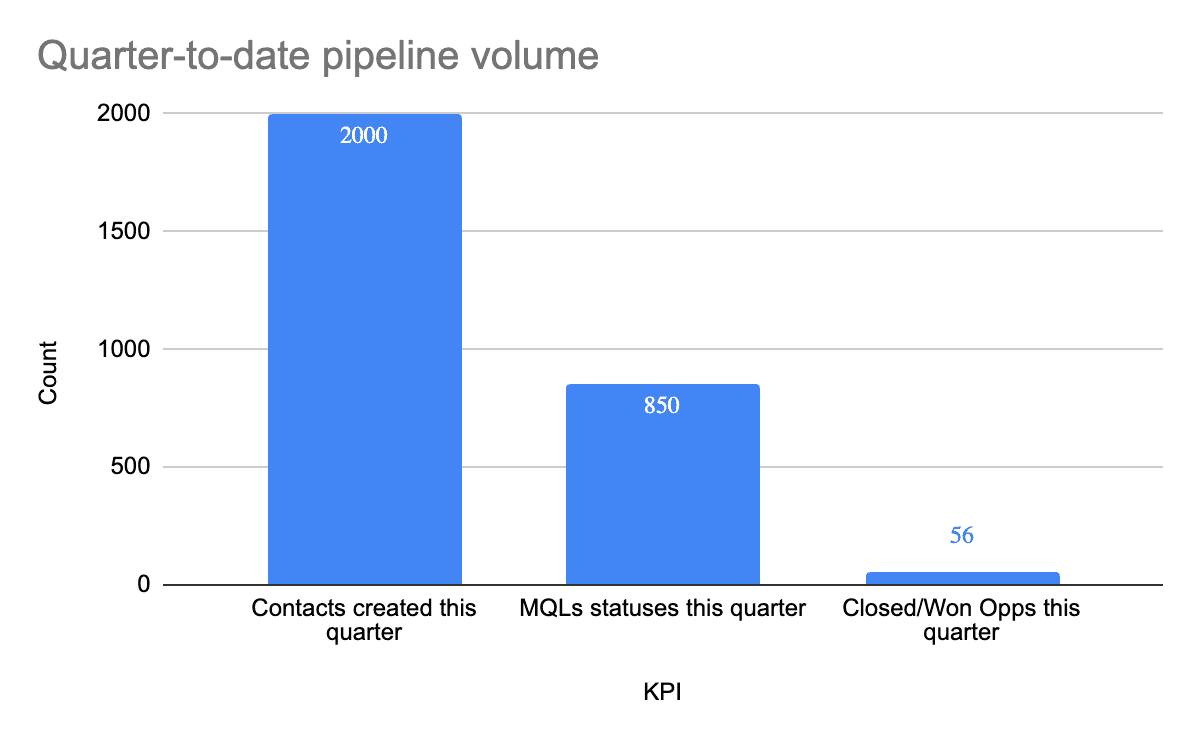
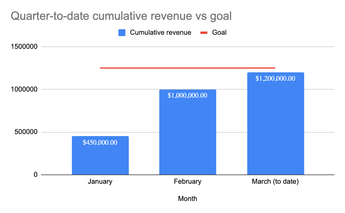
At first glance, it seems like you’re in great shape to hit or beat your revenue goal for Q1. Through that lens, it is easy to conclude that we produced enough pipeline volume, which, for Q1 will likely turn out to be true.
What these charts don’t reveal, though, is how the Q1 revenue was produced and what that means for future quarters.
Specifically, here are a set of key questions that these point-in-time reports leave unanswered:
Are you likely to close remaining Opportunities quickly enough to hit your goal for the quarter?
How many of the Closed/Won Opportunities in Q1 came from Contacts created in the previous quarter?
For Closed/Won Opportunities, was velocity through the customer journey faster or slower than the average sales cycle?
Were Q1 Opportunity wins influenced by new marketing and sales initiatives?
Have you created and retained enough volume in the pipeline for Q2?
Are there any concerning trends related to velocity or conversion rates that might compromise hitting goals later in the year?
To drive the point home, let’s consider a few other dynamics inside this particular business:
In Q1 you began testing a new nurturing process designed to further ‘warm up’ MQLs before they enter the formal sales process. While more effective, the nurturing process lengthens the sales cycle, but point-in-time reports obscure that trend.
At the beginning of Q1, you also had marketing work with sales to re-engage old contact lists, cold leads and Closed/Lost Opportunities, which created a positive bump in Closed/Won Opportunities.
As you can see, the realities underneath what seem like encouraging reports are setting the businesses up for a frustrating second-quarter.
If the new nurturing process continues to lengthen the sales cycle beyond 3 months, the Q2 goal is in jeopardy. In all likelihood, the new process would get some of the blame even though, in reality, the higher conversion rates would be better for the business in the long-run. Also, the bump in Closed/Won Opportunities isn’t replicable in Q2 because the volume of cold leads and lost Opportunities has already been tapped. To reproduce or beat Q1 revenue results, there would need to be a material increase in pipeline volume. Practically, this often looks like celebration devolving into scrambling halfway through Q2, but by then it’s already too late to save the quarter.
If you’ve ever been caught off guard by what seemed like a sudden reversal of a positive trend, it’s very likely that point-in-time views, though accurate, obscured problematic trends that would have surfaced in a cohort view.
A Quick Note on the Data and Skills Required to Produce Cohort Reports
Many businesses forego attempts at cohort reporting because their data is a mess. As you would expect (and per our discussion above about timestamps and statuses), cohort reporting requires the ability to capture customer journey touchpoints and their associated timestamps, then leverage that data in some sort of reporting tool. CRMs and marketing automation tools rarely support cohort reporting, which leads most businesses to Excel, which is a great solution for smaller data sets. Larger datasets often require warehouse-based infrastructure and SQL. There are certainly advanced analytics tools, but they tend to be overkill for the reporting maturity of most companies (or are drastically underutilized if already in place).
Producing cohort reports also requires a more advanced understanding of event-based data, data analysis and the mechanics of pivoting data—skills that many revenue ops and even business analysts lack.
We won’t dig into the “how” of producing cohort reports in this article, but know that there are plenty of resources available for learning how to do the spreadsheet work.
Here are the steps we encourage businesses to take as they begin to leverage cohort reporting:
Perform a data audit to ensure you have the necessary data points (especially timestamps) and that the data is clean
Begin with a manageable amount of data and prototype cohort pivots and visualizations in spreadsheet format
Once stakeholders can see the value, invest in data pipeline and warehouse infrastructure and use inexpensive, but powerful tools to dynamically produce cohort-based dashboards
(As always, if you want to fast-track that process, we’d love to help.)
Use-Cases for Cohort Reporting
Cohort reporting can quickly become a deep subject and get into more complex modeling, especially for software companies leveraging advanced product and user analytics.
Because this article focuses on the fundamentals, we’ll cover important use-cases at a high level and provide several over-simplified B2B pipeline examples intended to help companies begin exploring and utilizing cohort reporting.
Calculating True Conversion Rates and Volume Benchmarks (Which Supercharge Point-in-Time Reporting and Drive Goal-Setting)
One of the most high-impact use-cases for cohort reporting is the accurate calculation of conversion rates and, subsequently, the pipeline volumes required to hit revenue goals.
Let’s return to our Q1 analysis and evaluate performance through the lens of a cohort report visualized as a multi-bar chart. Here we are leveraging data from the actual customer journey over multiple cohorts to understand trends in the percentage of our new Contacts who convert to down-funnel stages. Looking at multiple cohorts will give us a sense of overall conversion rates for the business.
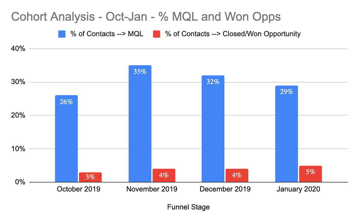
Here our cohorts are defined by the month the new Contact was created and the bars represent the percentage of that cohort who reached a lower-funnel stage at any point after creation.
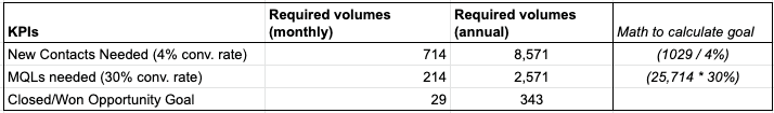
While there is some variation, all of the cohorts convert to MQL at a rate between 25% and 35% and to Closed/Won Opportunity at a rate between 3% and 5%. (If there were significant variances, that would be cause for digging more deeply into cohorts of interest.) This information is incredibly valuable. With some simple math, we can use these percentages to calculate required pipeline volumes to hit revenue goals:
While conversion rate analysis should be performed often to update benchmarks and understand actual performance, these cohort-based calculations are a great, mathematically sound first step in setting goals for the teams responsible for the pipeline.
Also, if we stop here and look back at our Q1 point-in-time progress report, it becomes clear that the pipeline is behaving abnormally compared to previous cohorts. For example, we need on average between 600 and 700 MQLs to produce ~90 Closed/Won Opportunities. In Q1, though, we’ve produced well over 800 MQLs, but only 56 Closed/Won Opportunities so far, but are close to reaching our revenue goal.
That could be good or bad depending on what happened (i.e., closing a ‘whale’ account), but one thing is for sure: using Q1 to set goals for Q2 would be a disaster based on how actual cohorts tend to perform historically.
Tracking Efficacy and Long-Tail Impact of Spend Throughout the Entire Customer Lifecycle
The holy grail for many companies is being able to track marketing and sales efforts throughout the entire customer lifecycle, especially through the lens of spend. If your data and technology are clean and integrated, cohort reporting makes that possible, which is extremely powerful.
Where point-in-time reports are great for understanding top-of-funnel metrics like cost per lead or singular views of down-funnel efficacy, cohort reports allow you to “follow” campaign efficacy through the entire journey. Let’s look at an example:
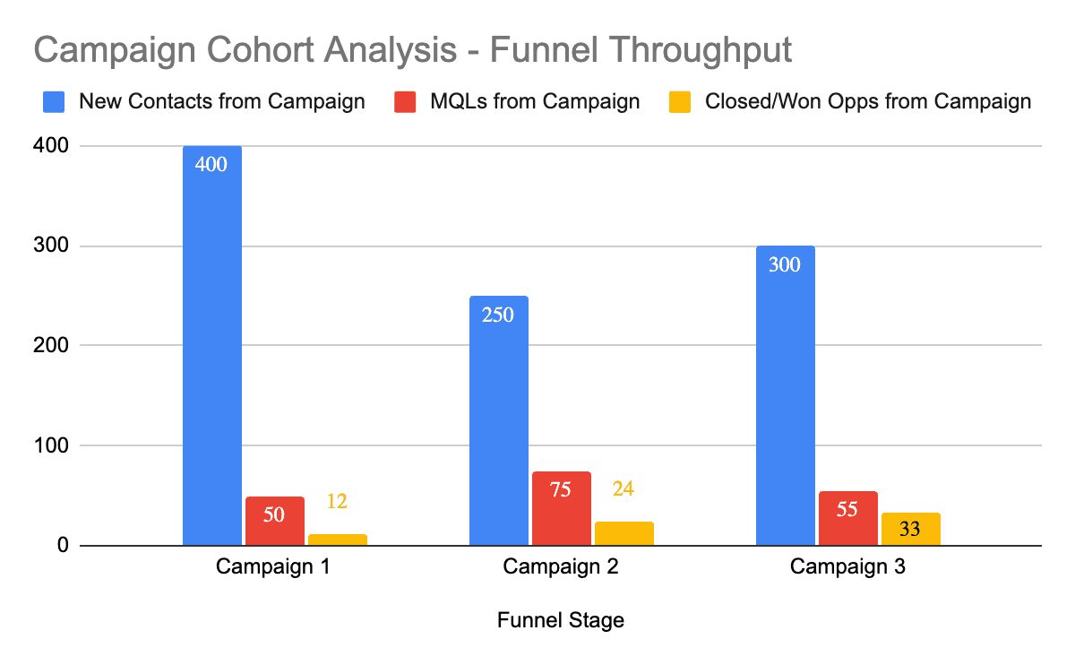
This report reveals not only which campaigns created the highest number of contacts, but the down-funnel conversion impacts of those campaigns. It’s clear here that Campaign 1 is effective at the top of the funnel, but converts poorly when it comes to Closed/Won Opportunities.
Cohort reports like this can help solve the classic “see-saw” effect of increasing and decreasing spend without visibility into the long-tail impact of that spend. For example, if spend is increased and lead gen spikes, but there isn’t a material increase in the number of deals closed in the following month (often analyzed through point-in-time reports), the experiment is flagged as a potential failure. If used properly, cohort reporting accounts for time lag and enables you to properly attribute the results of spend to results that happen later in time. (You’d likely want to view this type of cohort analysis in multiple types of visualizations.)
One of the most powerful benefits of understanding when spend or effort will turn into results is in forecasting. If you can predict timing of revenue with some level of accuracy, it will help you manage expectations and even push value back into the finance department.
These types of full-funnel insights are absolutely critical for understanding how to drive growth across the business and are often the game-changing learnings that help companies unlock new levels of growth.
Understanding the Velocity of the Customer Journey
Understanding conversion rates and long-tail impact from cohorts is great, but we also need to understand the timeline of those events.
Returning to our example, you believe the sales cycle is around 3 months, but what is the actual breakdown? Understanding true velocity is critical for forecasting and prioritization.
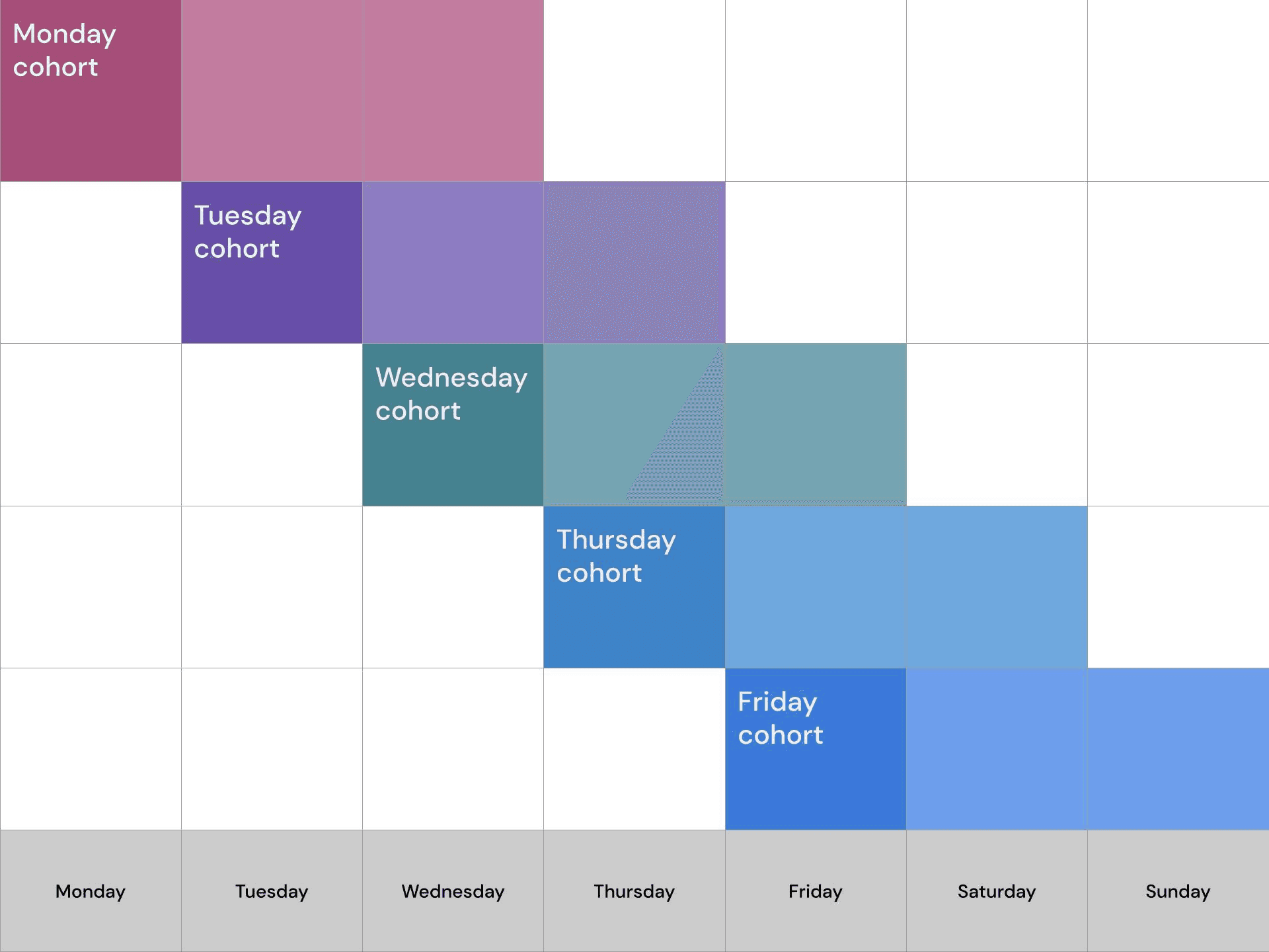
Let’s use an impact plot (also known as a triangle chart) to gain insight into the timeline from Contact creation to Closed/Won Opportunity.

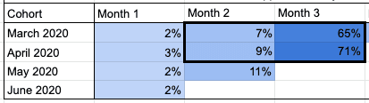
This cohort visualization is extremely valuable for applying actual data to the anecdotal belief that the sales cycle is about 3 months. The numbers reveal that it’s true that a majority of our Closed/Won Opportunities happen in the 3rd month after a new Contact is created, but that’s far from the whole story.
Following cohorts horizontally along rows, we can see that, on average, between 60% and 70% of new Contacts become associated with Closed/Won Opportunities within 3-months of creation (adding the values of Months 1-3). A full 30% of Closed/Won Opportunities happen after the 3-month mark, which is material (and should be cause for investigation and creation of additional cohorts for analysis).
Looking at the columns vertically, a concerning downward trend in conversions in Month 4 jumps out (23% → 16% → 8%). Specifically, there were strong conversions in Month 4 for the October cohort, but that performance erodes significantly in the following months.
Remember above that Q1 saw a big push for re-engaging cold leads and Closed/Lost Opportunities. It’s likely that many of the conversions from those populations in Q1 came from Contacts created in the October 2019 and November 2019 cohorts, meaning Month 4 for October and Months 3 and 4 for November have higher conversion rates. No matter the cause, this is, again, reason for additional analysis and ongoing cohort reporting to understand and control for the potentially negative trend.
At the very least, this analysis has revealed that, based on the past few cohorts, we’re only likely to see 60-70% of the pipeline close in a 3-month timeline—an incredibly important insight for forecasting, setting expectations and prioritizing the work of various teams.
Note that this same paradigm applies for various stages in the customer journey and various business models—the main point is understanding behavior over time. For example, an eCommerce business might want to analyze the timeline between first and second purchase, whereas a SaaS company might want to understand how the % of active users erodes in the months after signup.
Understanding the Impact of Changes to the Customer Journey (from testing, process updates, etc.)
Because testing happens chronologically, point-in-time reports make it very difficult to determine effectiveness over time, especially when you are optimizing multiple parts of the customer journey. Cohort reporting, though, allows you to isolate testing groups by time, giving you insight into the impact of your tests.
Returning to our example, let’s say we avoided the mistake of planning around the point-in-time view of Q1 and have been driving our teams against our data-derived goals. We’ve been seeing pretty good results, but the board would really like to see us clean up the long tail of conversions and close more deals within a 3-month window.
To that end, at the end of Q1 we decided to launch an account-based marketing initiative to educate prospects on our value propositions before they enter the funnel and implement an SDR cadence to pre-qualify Opportunities.
Our handy cohort report enables us to quickly and clearly see the results:
While it’s still early, we can clearly see that our ABM and SDR efforts launched in March have driven strong improvements in conversion in the April cohort, both in Month 2 and Month 3. In other words, the data suggests that updates to our marketing and sales process are working (though we’ll want to continue to track improvements).
The flip side of this example can cause significant confusion and disappointment when positive early indicators don’t produce results expected down stream. Let’s say you launch a free trial program that drastically increases the number of new Contacts and MQL count. Point in time reports would tempt you to celebrate because of the increased volume, but leveraging a cohort view of the test participants would reinforce the discipline of waiting to see the bottom-line results (and how long they take to materialize).
Calculating True Lifetime Value (LTV) and Retention Rate (and How They are Trending), Then Using Those Numbers to Calculate Growth Budgets
Calculating LTV is an entire topic of its own and there are various approaches depending on the business model and desired insight (historical VS predictive, etc.), so we’ll stick with a simple example for illustration in this article.
For our purposes, the growth reporting fundamental we want to hammer home is leveraging a data-driven approach to understanding how long you maintain a relationship with customers and how much revenue you make from them over the life of that relationship.
Here’s a simplified example of how you might go about calculating average LTV using a cohort-based analysis. We would note, though, that while averages can be helpful as an overview for the business and for other exercises like setting acquisition budgets, customers almost always fall into very different cohorts with very different LTV values. This example is intentionally simplified for the sake of illustration.
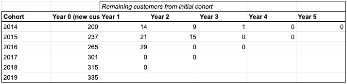
Since our B2B example runs off of annual contracts, let’s look at how many customers stick with us over a multi-year period:
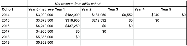
Next, let’s plot total net revenue on the same matrix:
Now, if we divide the matrices, we can average the values in each column to determine the average net revenue generated in the “N-th” year of being a customer. When you add all of those values together, you have a data-driven average of expected lifetime value of a customer over a multi-year period:
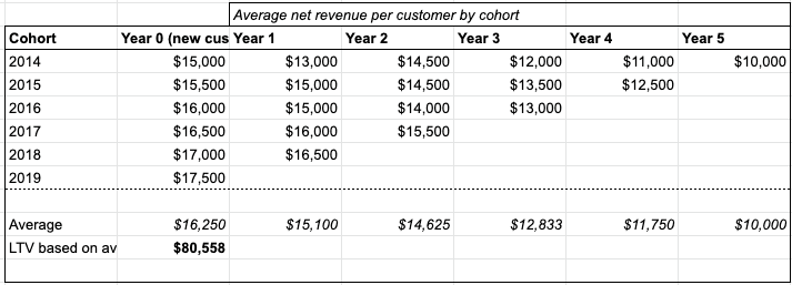
Again, this is a simplified example, but even a simple methodology for deriving average LTV from a comprehensive cohort analysis is significantly more accurate than analyzing a random handful of customers, who likely fall within various cohorts and, as a result represent a view different from reality.
Once you have a reliable LTV number, you can experience the joy of building mathematically sound growth budgets based on real unit economics using the LTV:CAC ratio and some simple math, but that’s another topic for another post.
Understanding and Reporting on True Performance Improvement
One of the most powerful utilities of cohort reporting is the ability to show true business improvement over time, which is imperative for understanding how to drive additional growth, but is also one of the most valuable assets for raising capital or selling a business.
In terms of net revenue, the LTV analysis above reveals that there has been meaningful improvement over time, driven by both the number of customers but also in the economic value of each unit (i.e., average contract value has increased over time). Those insights are powerful in and of themselves, but they don’t reveal improvement in business processes and revenue numbers are often achieved by unsustainable brute-force effort.
The powerful thing about leveraging cohort reporting is that you can show accurate, data-driven improvement over time both for revenue and the impacts of the processes and improvements that are driving that revenue.
Bringing our simple example full-circle, let’s say we continue to analyze conversion rates by cohort to track our efforts to close more Opportunities inside of three months. At the end of H1, we can present the board with this analysis:
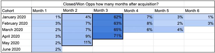
It’s great that you hit your revenue numbers, but the real win is that the growth is built on solid improvement through acquisition and business process testing over time, which is music to a board’s ears.
To drive the point home, let’s compare Month 2 and 3 conversion rates from the end of 2019 to the beginning of 2020:
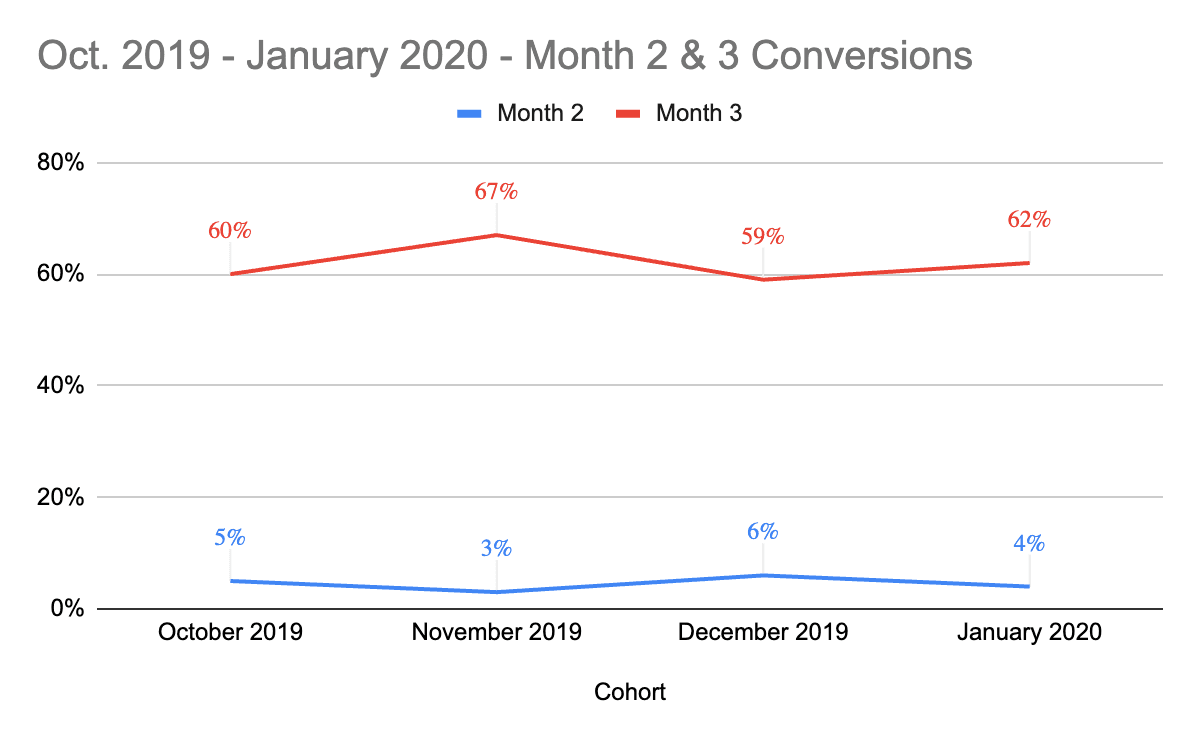
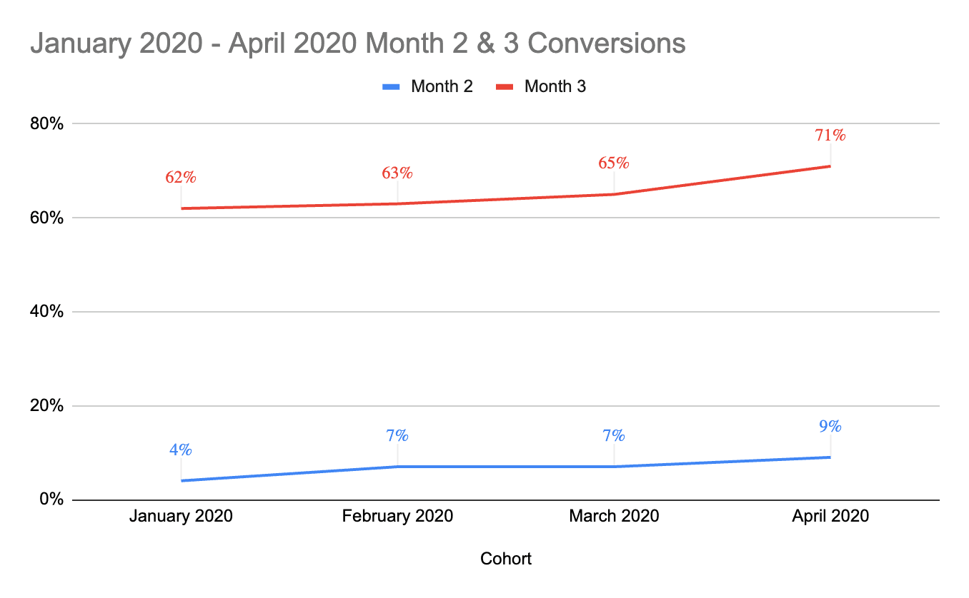
Q4 2019 reveals inconsistent performance with no clear improvement, but Q1 and the beginning of Q2 reveal a business who has a handle on analyzing performance, implementing improvements and optimizing, month after month. (Again, this same paradigm can be applied to different parts of the journey and business models, from repeat purchase to churn). Combined with the revenue analysis, these reports paint a very compelling picture for the board.
Summary: The Recipe for Growth Reporting Fundamentals
Now that we’ve covered the details of basic point-in-time and cohort reporting, we can look at how to combine them into the recipe that digital leaders use for growth reporting.
Here’s how the best companies build truly meaningful reporting:
1. Define the questions you want to answer
Reporting can be a wandering house of mirrors if you don’t start with the questions you want to answer about your business. What are your biggest challenges? Where do you lack visibility? What parts of your go-to-market strategy need validation? Which teams are under-performing? Which teams are over-performing?
2. Talk to your actual customers to gain qualitative insight
Before you dig into the numbers, it’s always healthy to talk with your actual customers to better understand both their journey and the value your product/service provides. Every time we help our clients perform qualitative customer research, everyone discovers something new that the data hadn’t revealed in the past. (We’d also argue that customer interviews need to be a regular part of your business process.)
3. Check the data
Bad data produces bad reporting. Are your customer, touchpoint and transaction data in shape to drive meaningful reporting?
If not, and customer data hygiene has been a constant problem for you, it’s time to bite the bullet and tackle the project that will pay dividends for your business across all departments: clean your customer data and implement a data governance process and ops team to make sure it stays clean.
If you don’t clean your data now, you’ll pay with lack of visibility and unnecessary man hours until you do.
4. If you have historical data, leverage cohort reports to gain an understanding of past performance, appropriate benchmarks and growth budgets
If you have it, historical data is a gold mine for understanding how your business has expanded over time. We’d recommend starting by:
Determining who your most valuable customers are and analyzing their journeys and LTVs on a cohort basis
Understanding velocity, time-to-results and any meaningful variances by cohort
Understanding past trends in retention, repeat purchase, seasonality, impact of pricing changes, churn and more
Once you have a handle on how many customers convert how quickly, you can use an analysis like the one mentioned above to build data-driven volume targets that mathematically should produce your revenue goals (with the understanding that things change and those are a starting point).
You can also leverage LTV analyses to build bottoms-up growth budgets, which will make your finance team extremely happy.
5. Set up point-in-time dashboards for top-of-funnel and single-point efficacy reporting
Using the benchmarks and goals you derived from the previous cohort analysis, set up point-in-time reporting dashboards that give daily, weekly and monthly insight into channel efficacy for lead gen, paid performance (cost-per-lead, etc.) and volume, including single-point attribution for lower-funnel stages (i.e., which channels brought in deals that closed this month).
Additionally, set up ad-hoc point-in-time dashboards for significant top-of-funnel tests, especially around messaging, paid campaign variables (audience performance, etc.) and other efforts designed to achieve step-wise gains (not simply optimize stuff that’s already working).
6. Set up cohort reports (or dashboards) for consistent insight into performance over time
And last, but certainly not least, set up consistent cohort reporting, ideally in a dashboard if you have the infrastructure. Depending on your business model, you’ll want to consistently report on, at a minimum:
The impact of process and customer journey tests that improve key performance metrics across marketing and sales(velocity, conversion rates, activation, etc.)
How long it takes for paid spend to turn into revenue, which enables much more accurate forecasting
Retention and churn
Lifetime value
Combining all of those ingredients isn’t for the faint of heart, but those who prevail will achieve insight into their business that is not only rare, but will enable them to achieve unprecedented growth.